7 Vintage iPhone Wallpapers for a Curated, Collected-Over-Time Aesthetic
There's a particular quality to a screen that feels considered — pulled from a mood board rather than a default gallery, worn-in rather than just downloaded. These seven vintage iPhone wallpapers sit in that register: soft palettes borrowed from faded botanical prints, old oil studies, and sun-bleached postcards. Each one is the kind of image you'd frame if you could.
What Makes a Vintage iPhone Wallpaper Actually Feel Vintage?
The difference between a wallpaper that reads as nostalgic and one that just reads as desaturated comes down to a few things: muted midtones rather than pushed grays, organic subjects over geometric patterns, and a composition with some breath in it — negative space that doesn't feel like an afterthought. The picks below share those qualities. They feel like they belong in a linen-curtained flat with a stack of dog-eared art books on the table, not in a filter pack.
1. Timeless Echoes Among Ruins
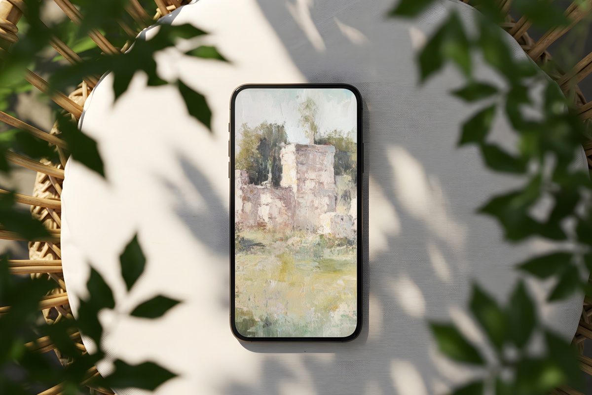
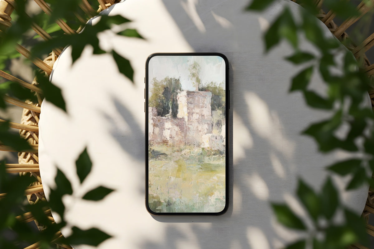
Crumbled stone rendered in chalky parchment and dusty sage — this one opens with the stillness of an afternoon in a forgotten courtyard. The tonal range stays deliberately narrow, holding the eye at a low, unhurried pace. It reads almost like a daguerreotype softened by decades of light exposure. Pull this out of your pocket and it looks like a detail from a heritage travel journal rather than a phone screen.
2. Orchard in Spring's Brush
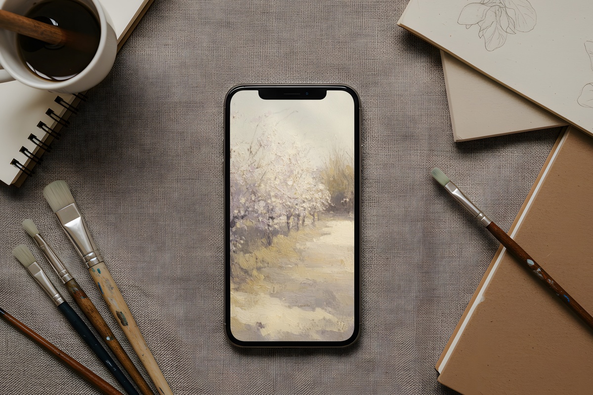
Blush fading into warm ivory, with the loose gestural quality of a plein-air study — this is the wallpaper for someone whose bedside table holds a half-read novel and a glass of water going warm. The orchard subject floats with an impressionist softness that never tips into saccharine. It pairs naturally with a home that leans toward natural fiber and low-key botanicals, where nothing is trying too hard.
3. Whispering Daisies Waltz

Warm taupe and bone with daisy forms rendered in a rhythm that feels more choreographed than random — there's a quiet formality to the spacing that gives it editorial weight rather than craft-market sweetness. Honestly, daisy florals can veer precious very quickly. This one holds a cooler distance, the kind that works on a lock screen and doesn't make you wince two weeks later. Rooms with travertine or aged oak would recognize it immediately.
4. Dreamscape Forest Whispers
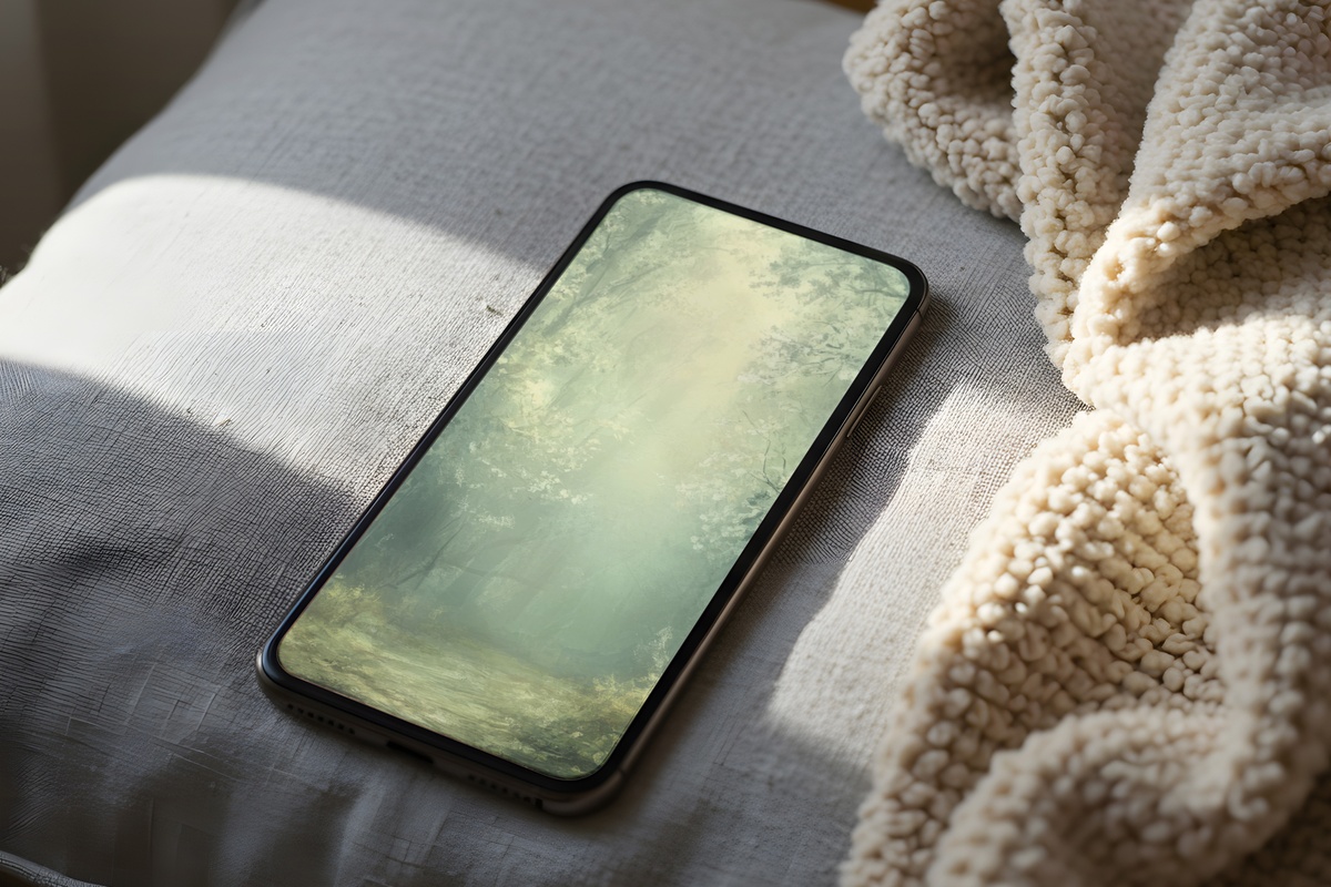
Somewhere between a misty watercolor study and a faded nature plate torn from a Victorian field guide — the forest here is rendered in greyed-olive and dusk-blue, with depth that pulls you further in each time you look. Glance at this on the morning commute and you get forty seconds of something that genuinely feels removed from the rest of your notifications. Not escapist exactly. More like a small clearing.
5. Daisies in Dreamy Dance
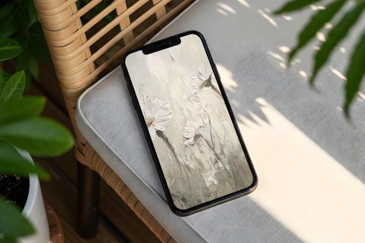
Where Whispering Daisies Waltz holds its distance, this one leans closer — the floral forms here are looser, slightly more movement in the stems, a palette that shifts toward warm cream and faded parchment rather than taupe. It has the energy of a bouquet set in a white ceramic jug on a kitchen windowsill, caught in afternoon light. A natural match for soft-life and coquette aesthetics, though never limited to them — the muted register keeps it genuinely versatile.
6. Pastoral Equine Reverie
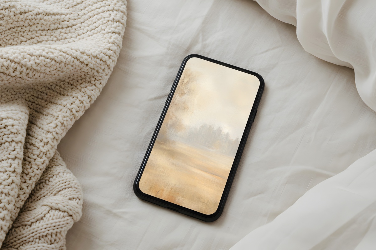
A beige and raw-linen field, a horse rendered with the kind of unhurried brushwork that belonged to eighteenth-century pastoral oils. This is the pick for someone who would also hang a quiet equestrian print above a console table and call it done. The subject has centuries of decorative history behind it, and this wallpaper leans into that without irony — warm ground, restrained detail, a sense that the image has always existed somewhere already. Settled. Authoritative in its quietness.
7. Canopy Symphony of Greens
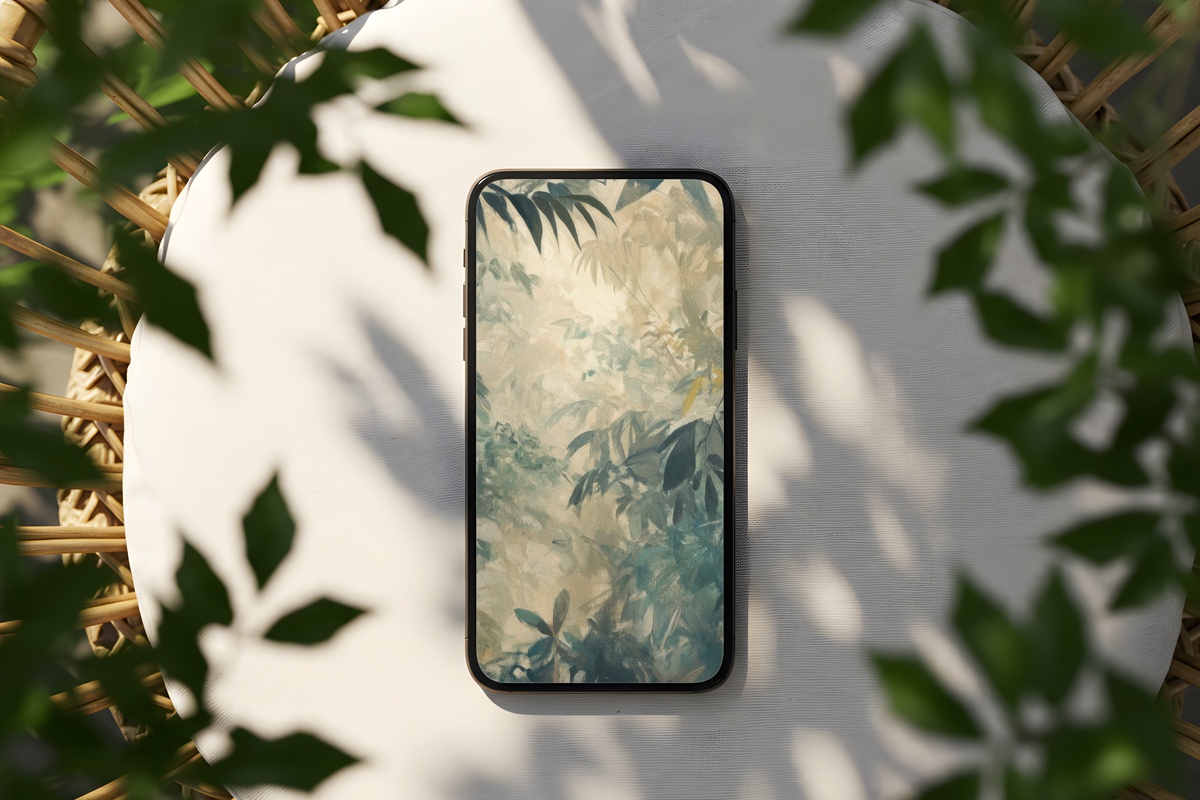
Layered canopy greens — moss, fern, sage, and a deeper forest floor — rendered with a softness that reads less like a photograph and more like a botanical study left in the sun too long, in the best way. The vertical rhythm of the composition fits an iPhone screen as if it was made for it, which means icons sit against it without competing. Anyone who keeps living pothos and framed herbarium prints in the same room will recognize why this works so well.
Every piece here arrives as an instant download — on your screen within a minute of choosing, no subscriptions, nothing to wait for. If a particular palette speaks to you, it's already there whenever you're ready. And if you find yourself drawn to two or three — or want to carry the same visual mood across your phone, a framed print on the wall, and a Frame TV screen — it's worth knowing that any mix of three pieces from across the Gallery Flair collection brings the total down by 30%, and five pieces brings it to 50% off. Wall art, wallpapers, Frame TV art: all of it counts together.
Build the quiet world you keep picturing. It costs less than you'd expect.