7 Summer iPad Wallpapers to Refresh Your Screen This Season
There's a particular pleasure in opening your iPad on a slow summer morning — the light already warm through the curtains, a glass of something cold nearby — and finding your screen exactly matches the mood outside. These seven picks are the ones we keep returning to for that feeling: considered, atmospheric, and unhurried.
What Makes a Summer iPad Wallpaper Worth Keeping?
The best screen art for summer doesn't shout. It settles into the periphery of your day and adds a quiet layer of intention. Look for palettes drawn from salt and heat and shadow — ochres, washed blues, dusty blush, bone. Notice whether the composition breathes: enough negative space that the image doesn't compete with your icons but instead frames them. And choose something you'd actually want to sit across from for three months. A wallpaper that earns its place is one you forget is digital.
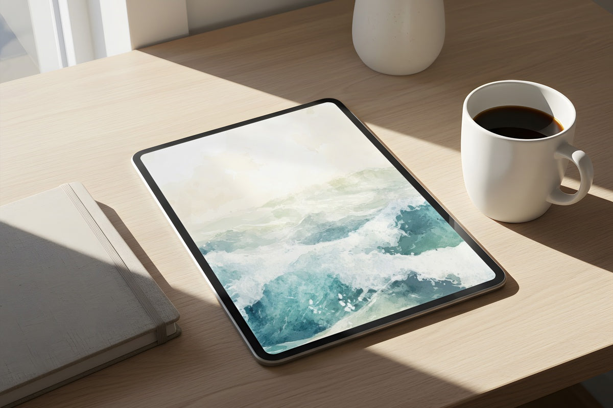
1. Ethereal Summer Surf - iPad Wallpaper

Open your iPad on a Sunday and this is the screen equivalent of stepping barefoot onto warm sand with the ocean just ahead. The palette moves through layered cerulean and sea-glass tones, with a softness that reads less like a photograph and more like a memory of one. Light diffuses across the surface in a way that makes the image feel alive without being busy. Anyone whose summer ritual includes an iced coffee and an iPad in the garden will recognize exactly what this mood is reaching for.
2. Cherry Blossoms' Gentle Glow - iPad Wallpaper

Creamy white and the faintest blush — this one sits closer to a linen-covered table at an outdoor lunch than to anything tropically obvious. The blossoms are rendered with a kind of hazy luminosity, petals dissolving at their edges into warm off-white, so the whole image reads more as light diffused through gauze than as a botanical print. If your aesthetic leans toward the understated end of summer — linen, rattan, unscented candles — this is the piece that fits without announcing itself.
3. Desert's Elegant Symphony - iPad Wallpaper

Here's the thing about desert palettes in summer: when they land right, they feel less like heat and more like stillness. This piece draws on terracotta, pale dune, and a muted rose-gold that deepens toward the center — the sort of color study you'd find in a well-edited gallery rather than a travel catalog. The tonal layering is patient and deliberate. It rewards a screen with good brightness and works especially well if your space already holds warm wood tones or raw-finish ceramics.
4. Sunlit Whisper of Palms - iPad Wallpaper

Ochre sky meeting dusty blue — it's a pairing that summer light produces for about twenty minutes around six in the evening, and this wallpaper holds that exact window still. The palm forms are present but not literal, softened to near-abstraction so the piece reads as mood rather than postcard. There's a generosity to the negative space here; your apps sit over it without feeling crowded. A strong candidate if you find coastal themes usually tip too far toward souvenir territory. This one doesn't.
5. Sunset's Golden Embrace - iPad Wallpaper

Warm amber, deep honey, a trace of burnished copper at the edges. This is the summer wallpaper for someone whose idea of the season is less about the ocean and more about golden hour on a terracotta patio. The texture beneath the color gives it a weight you rarely see in digital art — something between sun-warmed linen and the inner cover of a well-kept journal. It pairs naturally with warm-spectrum phone and desktop wallpapers if you're building one cohesive visual palette across devices.
6. Glimmers of Coastal Grace - iPad Wallpaper

Soft aqua, pearl, a whisper of sea-foam green — the palette here is almost audibly quiet. What makes it work is that the pastel range doesn't slide into saccharine territory; the tones are desaturated just enough to read as considered rather than cute. It's worth noting that if bold color contrast is your preference, this probably isn't the right fit for your screen — but if your whole aesthetic runs toward the hushed and airy end of the spectrum, this piece will feel like it was always there.
7. Whispers of Seaside Minimalism - iPad Wallpaper

Warm beige, fine horizontal rhythm, and almost nothing else — which is exactly the point. This is restraint practiced at the level of a design philosophy, not an aesthetic shortcut. The beige here isn't flat; it moves between sand and warm stone depending on your screen's brightness, and the subtle linearity gives the eye somewhere to rest without demanding attention. Set it as your background and notice how your whole home screen suddenly feels more intentional. Sometimes the absence of noise is the loudest design choice.
Each of these is a digital download — on your device the moment you check out, formatted across multiple resolutions so it fits your iPad precisely without cropping awkwardly. Browse the full summer collection on Gallery Flair whenever the mood shifts, because a new season on your screen doesn't have to wait.
And a small note on building a set: every piece here pairs naturally with others in the Gallery Flair shop — wall art prints, Frame TV art, phone and desktop wallpapers — and the thresholds work across all of it. Pick any three pieces from anywhere in the shop and you're already at 30% off; reach five and that becomes 50%. One continuous palette, one quiet bit of math.