7 Modern Frame TV Art Picks That Define the Aesthetic
The lamp is dimmed. Dinner is somewhere between the table and the kitchen. And the Frame TV on the wall is doing something a framed print never quite could — holding the whole room in a mood. What's on that screen matters more than most people admit, which is why we put together this edit: seven modern Frame TV art pieces that each carry a distinct visual language, chosen for the way they read at 6 p.m. when the light goes golden and everything else goes quiet.
What Makes Modern Frame TV Art Actually Work in a Room?
Modern, in the art sense, isn't just a synonym for contemporary. It's a specific visual stance — restraint over decoration, a commitment to letting negative space breathe, palette choices that feel intentional rather than safe. For the Frame TV format, those principles translate into pieces where the composition holds from ten feet away and still rewards the closer look. We're after work that sits at the intersection of considered and livable: not gallery-cool to the point of feeling cold, not so neutral it disappears into the wall.
1. Desert Calm in Modern Brushstrokes - Frame TV Art
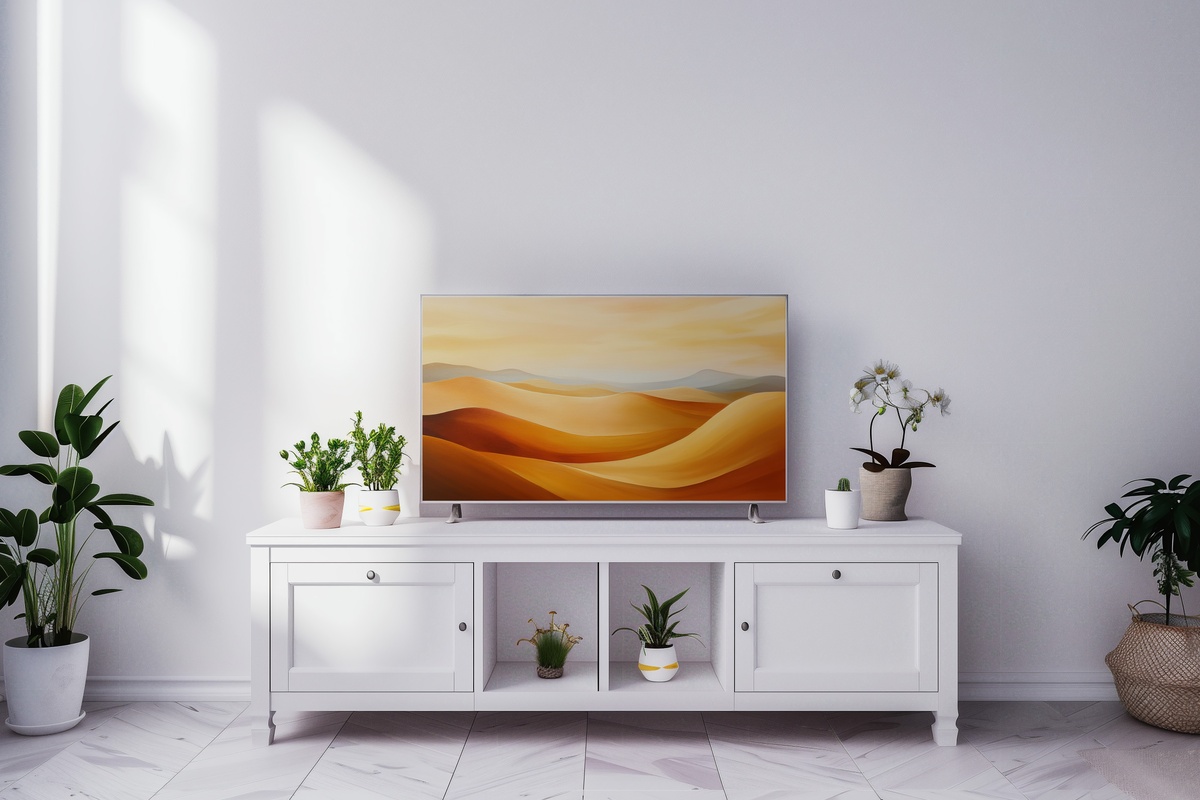
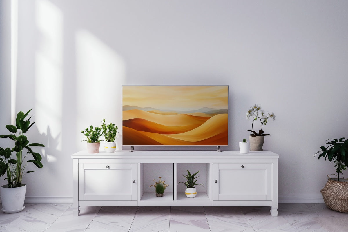
Ochre and raw sienna meet a wash of bleached sky — this one reads like late afternoon in a high-desert landscape where the heat has finally broken. The brushwork is loose enough to feel organic, structured enough to hold architectural weight. A piece that suits rooms anchored in warm neutrals: aged linen sofas, raw wood, terracotta accents that have been living there long enough to feel earned. When the overhead lights dim and the Frame TV is all that's lit, this palette radiates a low, amber warmth that a cooler-toned piece simply can't replicate.
2. Ocean Wave Blue Harmony - Frame TV Art
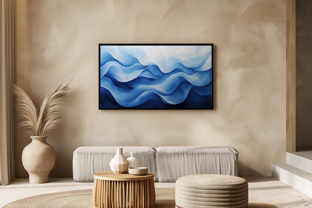
There's a specific shade of deep cerulean — somewhere between a calm open sea and a glazed ceramic bowl — and this piece lives in that exact register. The wave motion is rendered with enough restraint that it never tips into the kind of coastal kitsch you'd find at a beach-house rental. Instead, it carries the quiet authority of water understood as form, as rhythm. Rooms with white plaster walls and stone or concrete surfaces find a genuine counterpart here. Anyone whose bookshelf holds a small collection of blue-and-white pottery will recognize the instinct immediately.
3. Forest Serenity in Soft Neutrals - Frame TV Art
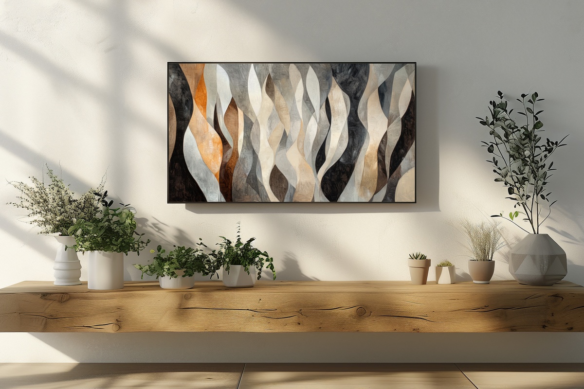
Soft sage, greyed taupe, and the particular off-white of morning fog through tree canopy — this is forest rendered as mood rather than illustration. The palette is close in temperature across the whole frame, which creates a visual hush: nothing demands attention, yet the eye finds depth and keeps returning. It's a natural fit for rooms that already lean into biophilic textures — woven baskets, a potted fiddle-leaf, linen that's been washed enough times to soften to a cloud. A genuinely versatile anchor piece for a neutral room that wants a whisper of the outside in.
4. Oceanic Wave Rhythms - Frame TV Art
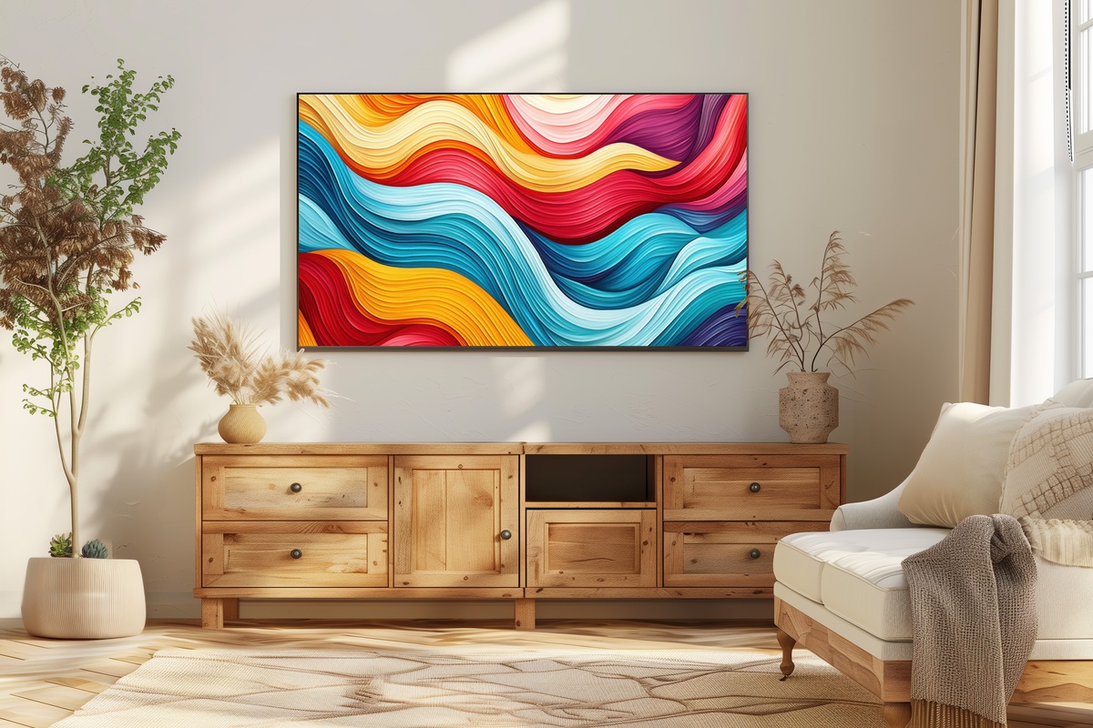
Where Ocean Wave Blue Harmony leans contemplative, this piece leans kinetic. The wave forms here carry a stronger sense of movement — layered strokes that build a visual rhythm you can almost hear as a low, rolling pulse. The tonal range is slightly broader, pulling in ink-dark navy alongside aquamarine and pale foam, and that contrast gives it a presence on a larger-format screen that softer pieces sometimes lack. If the room runs cool — slate floors, grey upholstery, steel fixtures — this one meets that energy rather than working against it.
5. Tranquil Pastel Landscape Whispers - Frame TV Art
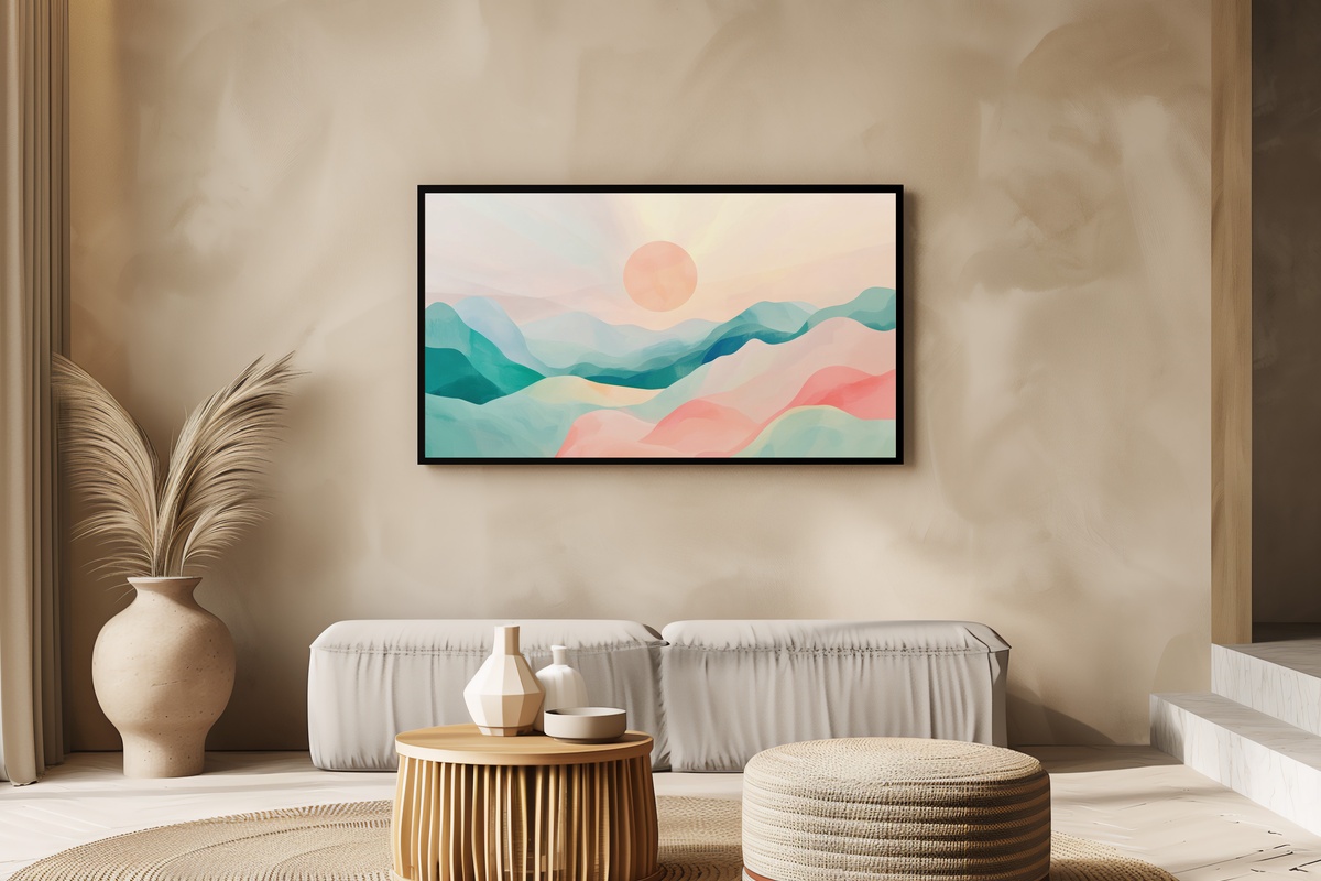
Blush, dusty lavender, the barest suggestion of peach along a horizon line — this landscape exists somewhere between a memory and an impression. The palette is genuinely delicate, which means we'll say it plainly: if your room skews industrial or high-contrast, this won't be your match. But for a bedroom Frame TV, or a sitting room built around soft furnishings and candlelight, it carries an almost-dusk quality that's difficult to manufacture with bolder work. The understatement is deliberate, and the restraint is what makes it land.
6. Bold Black & White Expression - Frame TV Art
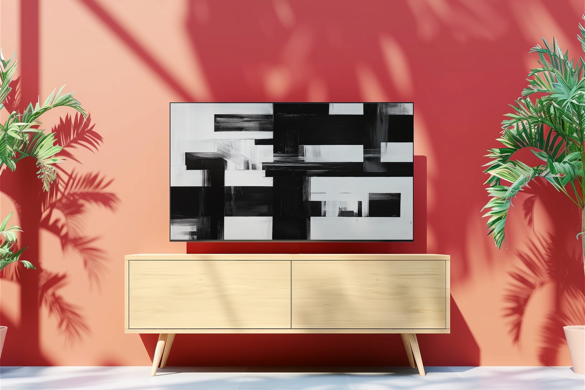
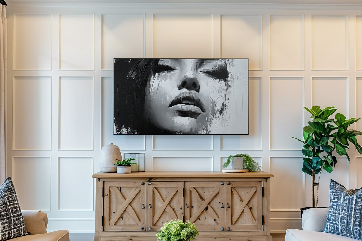
Monochrome art has a long history of looking like a shortcut. This piece sidesteps that entirely — the gestural marks carry genuine tension, and the interplay between deep charcoal passages and stark white negative space produces something closer to a conversation than a statement. It reads as confident without being aggressive. Worth noting for rooms already doing a lot: a busy gallery wall, layered textiles, maximal shelving. A single strong piece in high contrast can function as a visual anchor that brings competing elements into agreement. And on a Frame TV, the blacks go genuinely deep.
7. Minimalist Earthy Geometrics - Frame TV Art
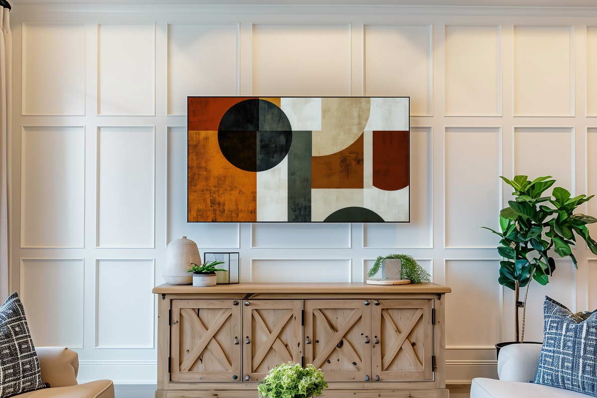
Clay, warm sand, a line of burnt umber against a field of undyed linen — the geometry here is soft-edged rather than rigid, which saves it from the coldness that can settle over purely mathematical compositions. The shapes suggest architecture, landscape, and abstraction all at once, without committing to any single reading. It pairs naturally with warm-toned Frame TV art from across this edit if you're rotating through a seasonal collection — the earthy register creates continuity with both the desert and forest pieces. And alone, it holds a room with a quietness that takes up exactly the right amount of space. Nothing more, nothing less.
Every piece in this edit is an instant digital download — on your Frame TV within minutes of purchase, no subscription, no waiting, yours to display and revisit as your rooms and moods shift. The full collection lives at Gallery Flair whenever you're ready to explore further.
One last thing worth knowing: the 3-for-30% and 5-for-50% discounts apply across every product line — Frame TV art, printable wall art, and device wallpapers all count together. Mix a couple of Frame TV pieces with a complementary wall print or a phone wallpaper in the same palette family, and the threshold math works in your favor across the whole order.