10 Summer iPad Wallpapers That Actually Capture the Season's Mood
There's a particular quality of light that only exists in summer — the way it softens everything to gold by late afternoon, or how a coastal breeze carries the weight of nothing at all. Your iPad screen sees that light too, every time you reach for it. These ten wallpapers were chosen to hold that feeling right there on the glass.
What Makes a Summer iPad Wallpaper Feel Right?
The answer isn't brightness — it's temperature. Warm ochres, salt-bleached neutrals, botanical greens, and watercolor washes all carry a seasonal register that cool-toned geometric art simply doesn't. Look for compositions with generous negative space (your icons need room to breathe), a dominant mood rather than a busy scene, and a palette that reads well both in direct sunlight and in a darkened room at night. Those three criteria guided every pick here.
1. Abstract Oceanic Dreamscape - iPad Wallpaper
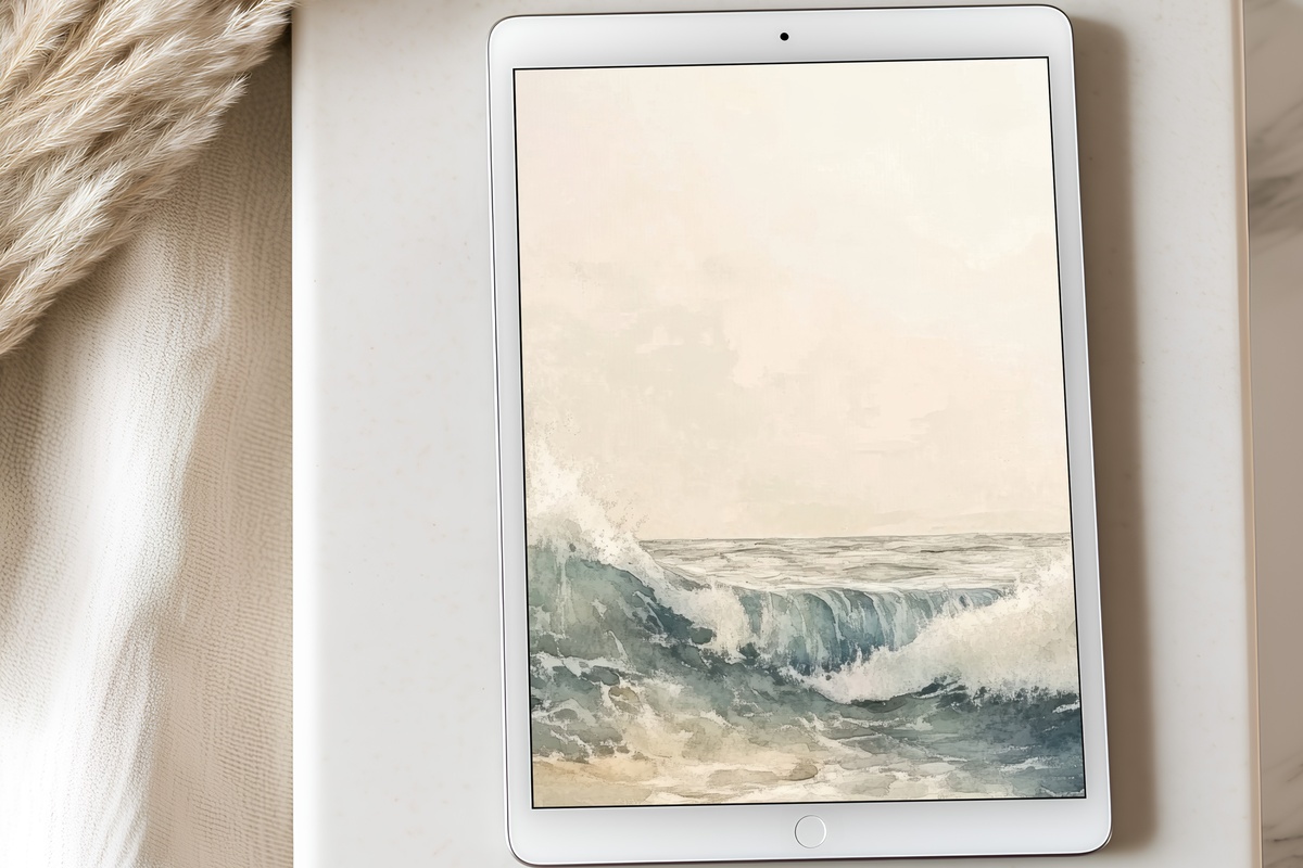
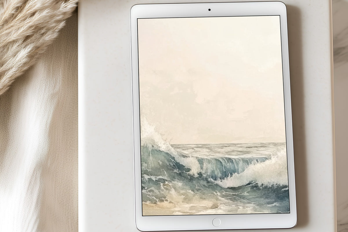
Watercolor at its most unguarded — layers of cerulean and pale aqua bleed into each other the way deep water does when you look straight down from a boat. The edges stay deliberately undefined, which gives the whole composition a sense of movement without restlessness. It reads as abstract enough to feel artful, coastal enough to feel unmistakably like summer. Set this one on a morning when you want the first thing you see to feel like open water.
2. Summer's Radiant Echoes - iPad Wallpaper
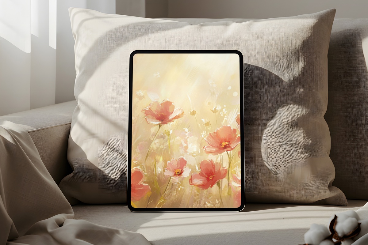
Coral has a reputation for reading too sweet, too resort-catalog. This piece finds the version that doesn't — a sun-warmed terracotta-coral that sits closer to dust than to candy, layered with creamy blush and the faintest amber undertone. The result is something between a Moroccan wall at noon and the inside of a shell. It holds warmth without shouting it. Anyone whose lock screen tends toward warm, saturated palettes will feel this one as an immediate yes.
3. Cherry Blossoms' Gentle Glow - iPad Wallpaper
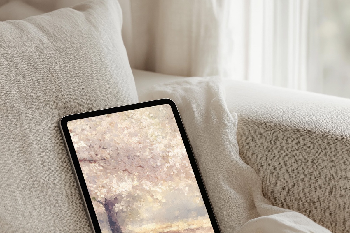
Creamy white petals on a ground that hovers between ivory and pale champagne — this one is quieter than the rest of the edit, and that's precisely the point. The blossoms carry enough botanical detail to feel real without becoming illustrative, and the overall lightness makes it one of the most screen-versatile picks here. Late summer evenings when you're reading on the sofa, the warmth it radiates is almost tactile. Closer to Japanese woodblock restraint than to anything overtly floral.
4. Soft Dunes' Serenade - iPad Wallpaper
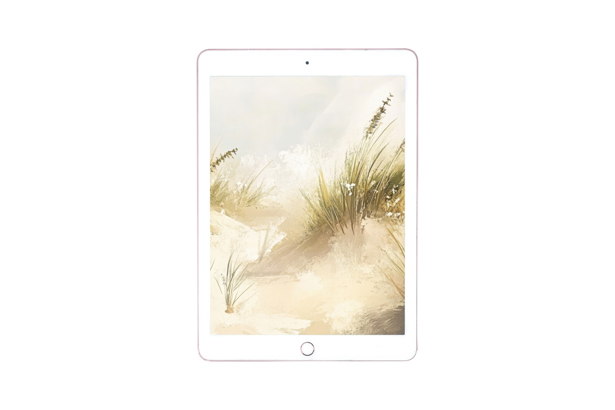
Sand tones rendered in slow, horizontal bands — warm beige, sun-bleached wheat, a shadow stripe of pale taupe. The rhythm is unhurried, almost meditative, which makes it a natural fit for a home-screen you return to dozens of times a day without wanting to change it. Not everyone connects with botanical or oceanic moods, and if your palette runs toward neutral earth rather than vivid blue, this is where the edit speaks to you directly. Grounded. Genuinely restful.
5. Emerald Dreams of Palm - iPad Wallpaper
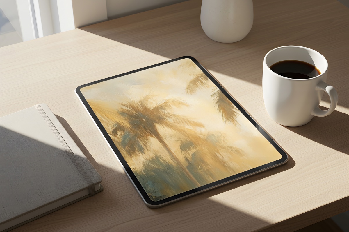
Deep emerald and dusty teal meet a washed ochre at the base — and the tension between those two temperatures is what makes this one linger. Palm fronds break the mid-field without crowding it, casting something that reads almost like dappled shadow. It's the lush counterpoint in the collection, the piece that brings the interior-garden, maximalist-but-measured energy. Pair it in mood with a warm sandy wallpaper on your phone or a botanical wall print for a living room built around that same green-and-gold contrast.
6. Sunlit Shores Symphony - iPad Wallpaper

Where the Oceanic Dreamscape goes deep, this one goes wide and luminous — pale sky blue washing down into a horizon line of soft sand, the whole palette rinsed with the kind of overexposed light you get at the beach around two in the afternoon. It feels less like a pattern and more like a place. The negative space is generous enough that your app grid sits within it cleanly rather than against it. A summer afternoon, distilled to a single screen.
7. Sunlit Whispers Through Woodland Trails - iPad Wallpaper
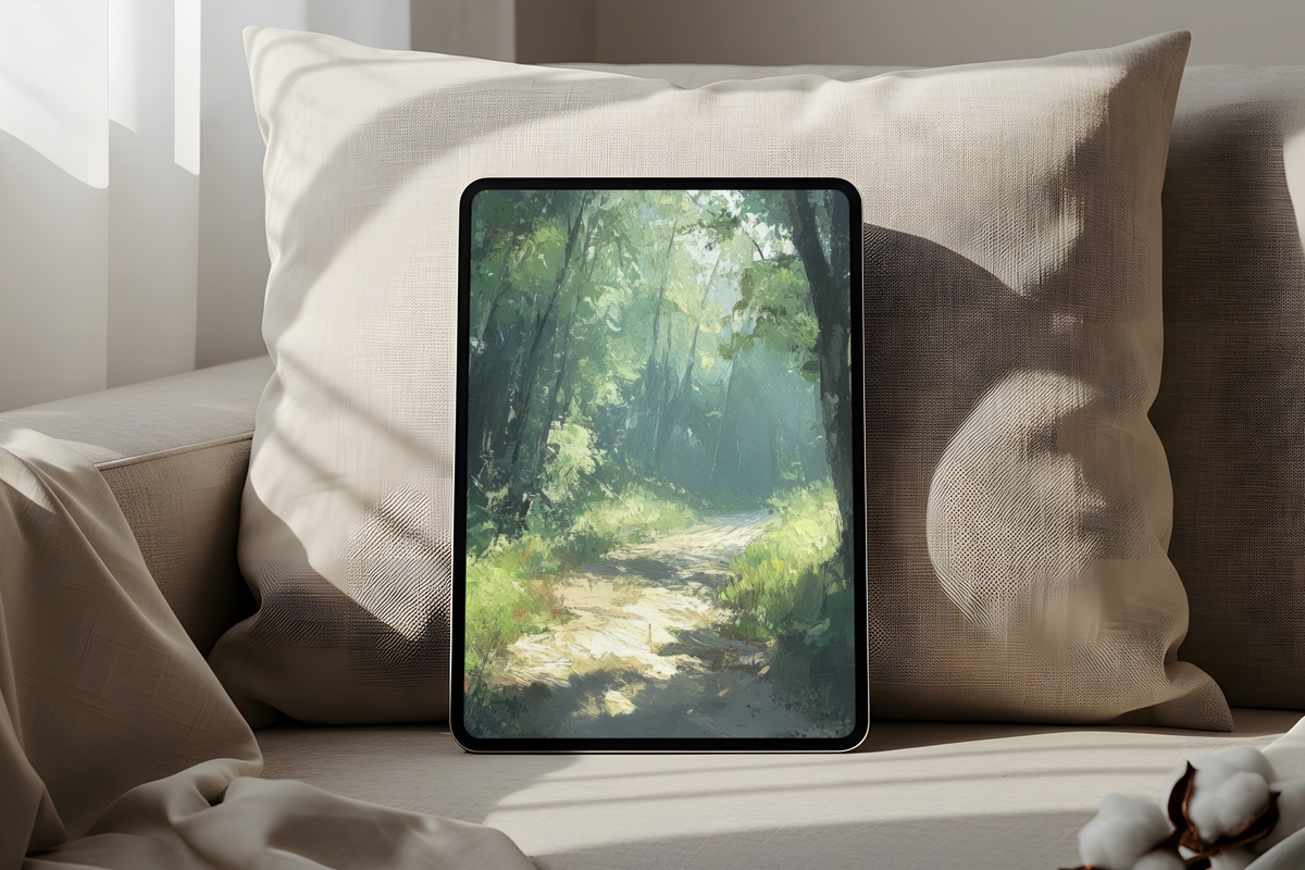
Summer isn't only coastal — and this piece is the edit's acknowledgment of that. Filtered light through a canopy of sage and moss green, the kind of green that comes from actual leaves rather than a color-wheel exercise. Soft gold breaks through in vertical shafts, giving the composition a cathedral quality that feels both grounded and lifted. For anyone whose summer means trails rather than shorelines, or whose apartment runs on plant shelves and linen curtains, this one resonates differently than the rest.
8. Radiant Lemon Glimmer in Sunlight - iPad Wallpaper
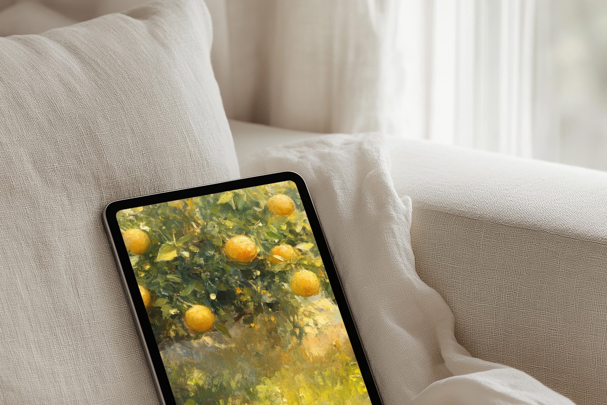
The most unexpectedly joyful pick in the collection. A warm, hazy lemon — not the sharp citrus of a graphic poster, but the soft glow of sunlight hitting a pale yellow wall through gauze curtains. It manages to be bright without being aggressive, optimistic without veering into children's-tablet territory. The tonal variation within the yellow keeps it painterly rather than flat. Reach for this one when you want your screen to feel like the first genuinely warm day of the year.
9. Whispers of Seaside Minimalism - iPad Wallpaper
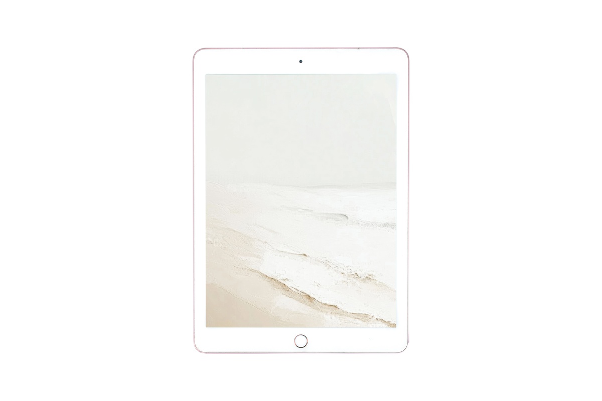
Warm linen beige meeting the faintest suggestion of sea — a horizon barely drawn, more felt than seen. The restraint here is the whole statement. Where several pieces in this edit carry distinct motifs or strong color temperature, this one steps back and lets the mood do everything. It's the wallpaper for someone who appreciates an uncluttered home screen as much as an uncluttered room. And because the palette is so neutral, it pairs with nearly any icon set or widget color you already have running.
10. Radiant Sunflower Whispers - iPad Wallpaper
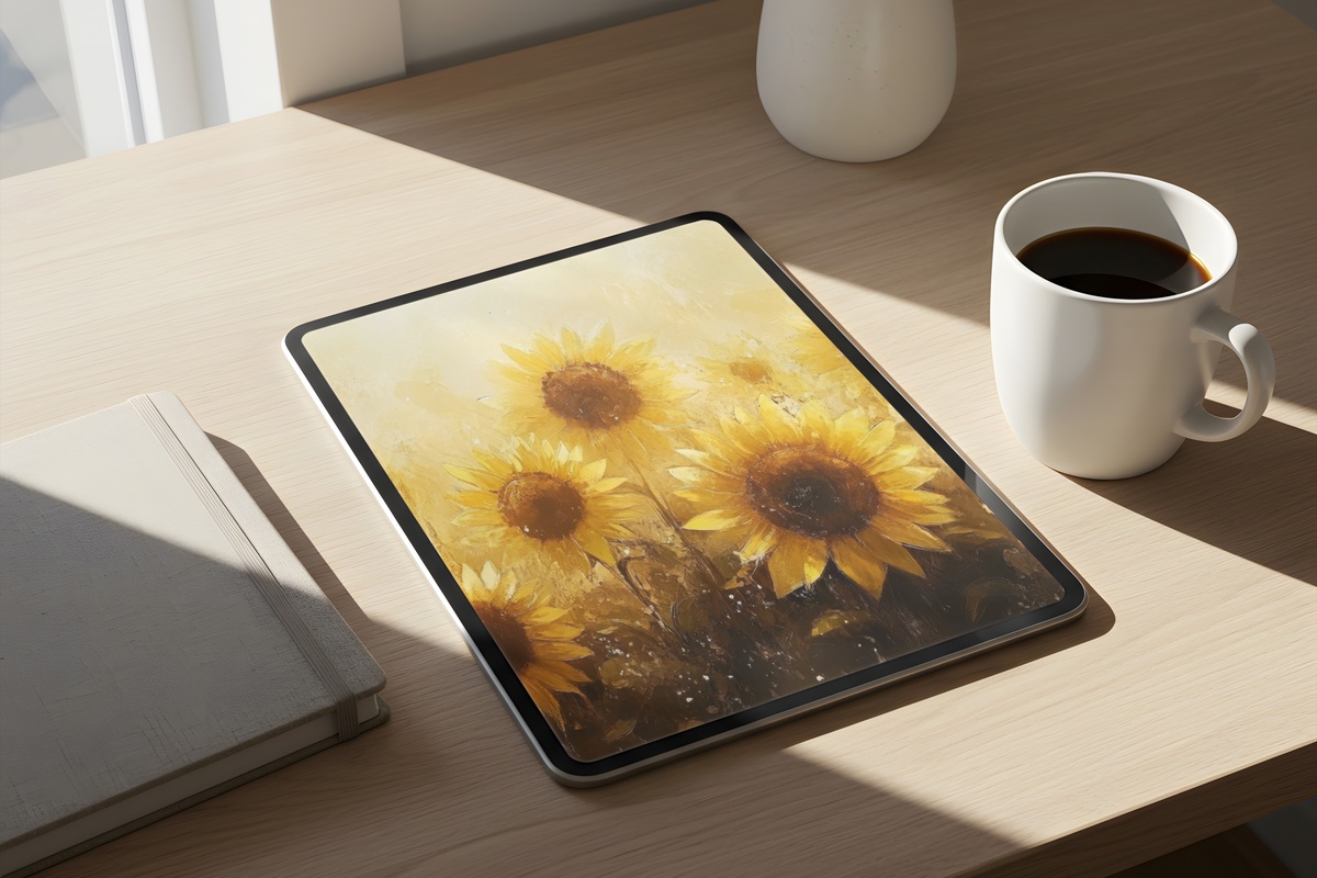
Sunflowers rendered without a trace of the rustic-farmhouse cliché they usually carry — instead, a warm golden honey palette treated with the softness of a gouache study, petals blurring at the edges into a field of amber and deep yellow. The composition uses generous negative space above the bloom, so the image breathes even when your screen is full of widgets. It closes the collection with exactly the right weight: warm, generous, unambiguously summer.
Each of these is a digital download — on your screen within moments of checkout, no waiting, no subscription, no expiry date. The collection stays open whenever you feel the season shifting and want your iPad to shift with it.
And if a few pieces are calling to you at once — which tends to happen with this edit — mixing across formats counts: an iPad wallpaper, a phone wallpaper, and a printable wall print in the same tonal family all qualify together. Three pieces brings 30% off the whole set; five brings it to 50%. That's the kind of math that makes building one continuous visual world across your home feel rather effortless.