10 Summer iPad Wallpapers for a Curated, Calm Living Room
There's a particular quality to summer light through a window — the way it flattens into something almost painterly by mid-morning, soft and diffuse, not yet the sharp heat of noon. Your iPad sits on the side table or propped against a stack of books, and that screen you glance at a dozen times a day deserves to hold some of that same feeling. These ten picks carry it.
What to Look for in a Summer iPad Wallpaper
The best summer wallpapers for tablets share a few things: a palette that reads quietly without competing with content, enough visual interest to hold up on a 10-inch or larger display, and a mood that shifts the unlock from task-mode to something a little slower. Look for compositions with generous negative space — they keep the lock screen breathing rather than busy. Watercolor-adjacent textures, botanical motifs, and horizon-drawn gradients tend to age well across the season.
1. Abstract Oceanic Dreamscape - iPad Wallpaper

Deep teal bleeds into foam-white at the edges, with loose watercolor strokes that feel pulled by tide rather than brushed by hand. The palette sits somewhere between a Portuguese azulejo tile and open water at dusk — rich without being saturated, oceanic without going nautical. On a large-format iPad display, the negative space in the upper register leaves room for the clock and date to breathe. A natural fit for rooms where linen, driftwood, and any shade of sea-glass already share shelf space.
2. Cherry Blossoms' Gentle Glow - iPad Wallpaper

Creamy off-white ground, petals rendered in the palest blush — this one is quieter than most floral wallpapers dare to be. There's no centred burst, no dramatic arrangement; the blossoms drift across the frame the way they actually fall, unhurried and asymmetric. If coquette and clean-girl aesthetics share a single mood board, this is somewhere in that overlap. Reach for it when the rest of your home leans into soft organic linens and that one ceramic vase you bought on holiday.
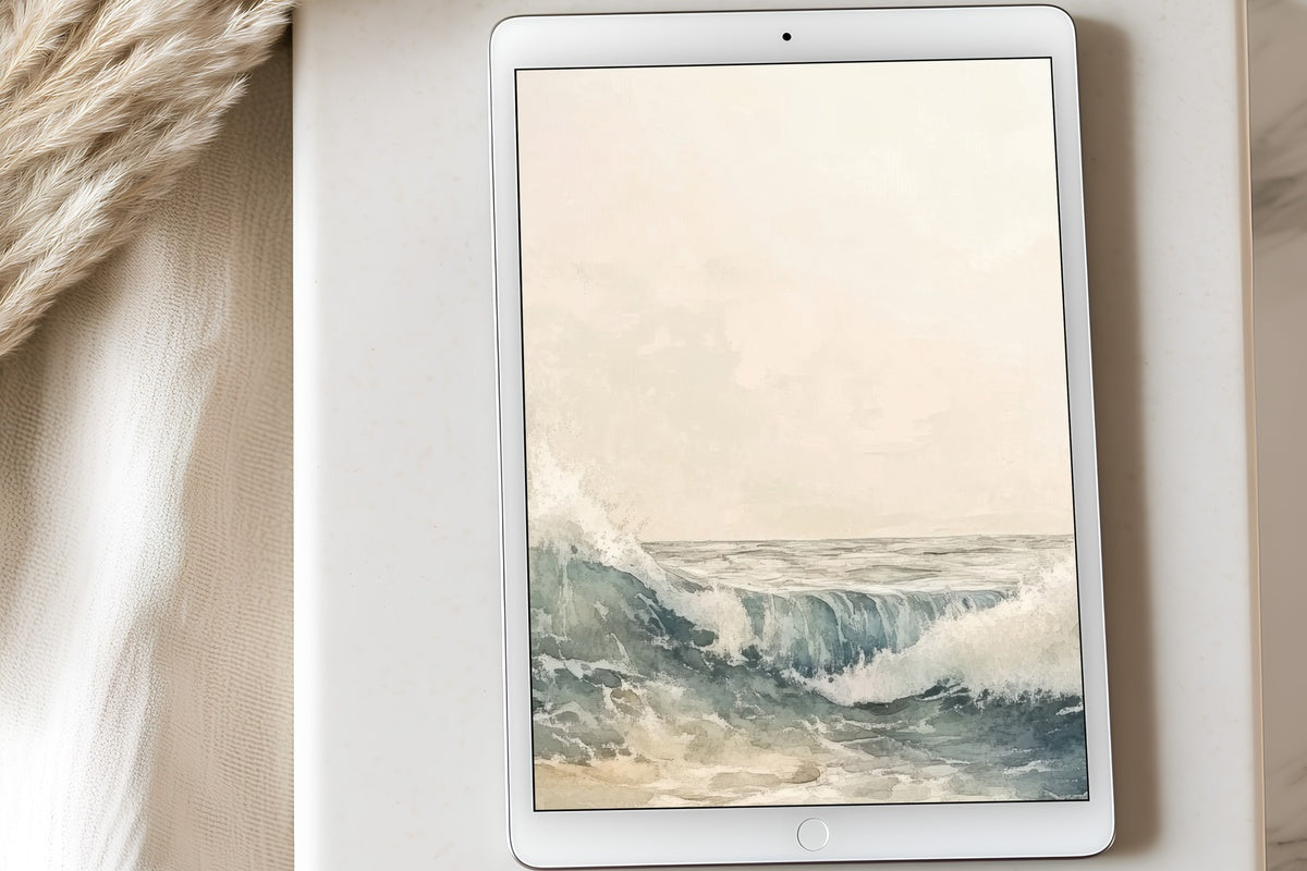
3. Vibrant Wave Symphony - iPad Wallpaper

Blues in three registers — cerulean, powder, and the deep slate-navy of deep water before it catches light — move across this composition like an actual wave: momentum at the centre, softening at the margins into warm sand-beige. It's more energetic than the rest of the collection, and honestly, that contrast is exactly the point. Anyone whose morning routine involves flipping open the iPad to a playlist and a coffee that hasn't gone cold yet will clock what this one is doing. Movement, but not chaos.
4. Golden Lavender Landscape - iPad Wallpaper

Amber gold meets dusty lilac in a landscape register — a horizon that could be Provençal fields at the end of July, or it could be purely abstract, depending on the mood you bring to it. That interpretive ambiguity is the piece's real strength. The warm-cool contrast keeps the palette from reading flat, while the hazy treatment of the lower field adds a sense of depth unusual for a tablet wallpaper. It works particularly well at the 9 a.m. laptop-and-iPad-side-by-side ritual: golden tones against a white desk feel almost sun-warmed.
5. Sunlit Whisper of Palms - iPad Wallpaper

Ochre and sky blue in a botanical frame — palm fronds rendered as suggestions rather than illustrations, loose enough to read as pure pattern from a distance. The warm ochre ground does something specific: it keeps the piece feeling like high summer rather than tropical pastiche. Where a lot of palm-print wallpapers tip into resort kitsch, this one stays closer to a Matisse gouache. Pair it with something cooler in your home palette — oyster-white walls, rattan, a ceramic in pale sage — and the screen becomes a warm focal point rather than a competing element.
6. Sunlit Shores Symphony - iPad Wallpaper

Pale sand, warm coastal light, and the lightest wash of blue above a horizon line — this one is pared back in the best possible way. We're drawn to how restrained the colour story actually is; it would be easy to push something called Sunlit Shores into oversaturation, and this doesn't. The tones sit comfortably in the same family as undyed linen and dried pampas, which means it layers well into rooms already built on a neutral, slow-living palette. Quiet in the hand, but not empty.
7. Gentle Radiance Over Secret Garden - iPad Wallpaper

Soft pastels gather here with the lightness of a watercolour study: sage, rose-tinted ivory, and the faintest mint. The garden in the title is present less as a literal scene and more as an atmosphere — dappled, unhurried, with that particular quality of light that appears only in walled gardens on overcast summer mornings. On screen, the pastel layering adds depth without adding visual weight. A considered pick for the soft-life aesthetic set, and equally at home on an Android tablet in a reading nook surrounded by trailing plants.
8. Whispers of Seaside Minimalism - iPad Wallpaper

If the previous picks feel like too much for your taste — and there's no reason they should have to be for everyone — this is the antidote. Warm beige at its most distilled: the suggestion of a shoreline, the barest horizon, almost no colour at all. The restraint is the whole point. On a high-resolution iPad display, the tonal subtlety actually shows beautifully; you catch gradients that flatten on lower-res screens. It pairs with a morning of journaling and a window cracked open to whatever warmth July is offering.
9. Radiant Sunflower Whispers - iPad Wallpaper

Warm butter-yellow and golden amber, with the botanical looseness of a field sketch — sunflowers caught not in full face but in peripheral motion, heads tilting slightly. It's a joyful palette without pushing into the candy-bright territory that ages poorly. The yellow here reads more like dried wheat in afternoon sun than anything neon-adjacent. Something about unlocking to this on a grey Tuesday morning does actual work on the mood. A piece that earns its place in a collection built on warmth and botanicals, whether on screen or hung on a wall nearby.
10. Wildflower Sunlit Harmony - iPad Wallpaper

To close the collection with something that earns the word harmony: serene pastels in lilac, blush, and the palest green, scattered across the frame in the irregular rhythm of a wildflower meadow rather than a curated garden arrangement. The composition has an organic looseness that reads as deeply considered rather than accidental — each element placed with enough breathing room that the whole feels light, almost weightless. For rooms layered in cottagecore or soft-botanical textures, this one draws a thread between the space around it and the screen in your hand.
Each of these downloads to your device in minutes — no account, no subscription, no waiting. The file is yours to keep and apply across every iPad or Android tablet you use, as many times as you like. Summer moves fast; setting one of these up now means you actually live with it through the season rather than noticing it was exactly right after it's gone.
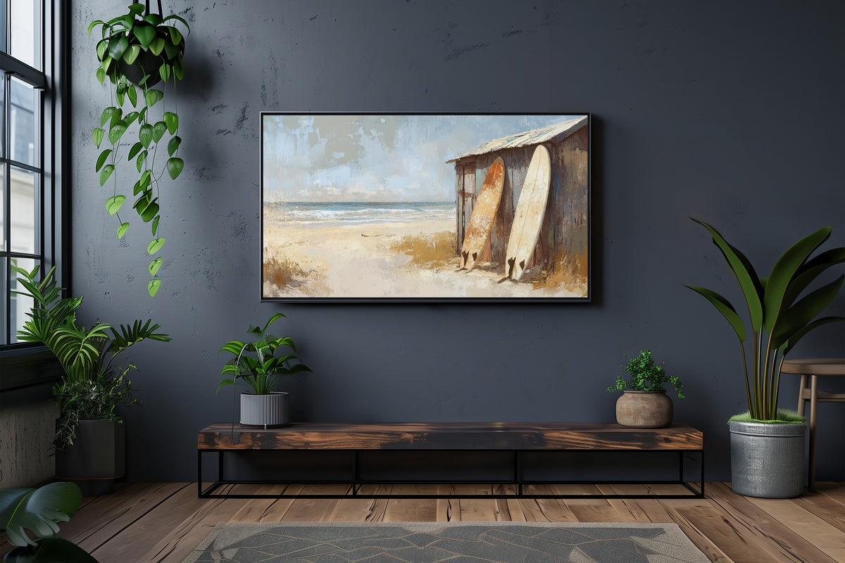
And if you're building a broader visual mood across your home — a wallpaper that echoes a printable on your wall or a piece running on your Frame TV — any three items across our iPad wallpapers, wall art prints, and Frame TV art count toward 30% off, and any five count toward 50% off. Mix and match freely across the lines. The collection is waiting whenever you're ready.
